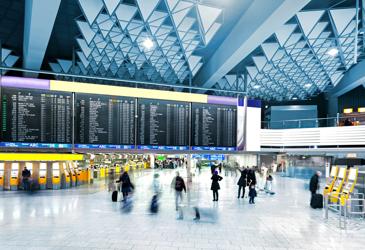
Beautiful design is not always synonymous with good design. To achieve the latter, it needs to be practical and serve the purpose for which it was created. You can create the most beautiful chair in the world and have it be impossible to sit on, uncomfortable or cause back or bum discomfort. This combination of design and usability is the essence of wayfinding, and in the sector that interests us here, wayfinding in airports. What is this concept and why is it so important?
What Exactly Is Wayfinding?
As the name implies, wayfinding helps people passing through a given physical space find their way around and circulate in a way that is comfortable for them – in the case of aviation, via an an information system that allows them to understand a complex space (like an airport or aviation routes) where the elements intended to move through it are created.
Wayfinding combines many disciplines – such as graphic design, architecture, lighting, landscaping, and even art – to provide a broad perspective of people moving in complex spaces (airports but also for example hospitals, shopping centres, road networks, etc.), including people with disabilities; from diverse social or cultural backgrounds; or young children travelling alone (because although airports are very safe for them, kids still needs to feel comfortable there).
The concept of wayfinding first appeared in 1960 in the book The Image of the City by Kevin Lynch. It was the result of five years of studying the cities of Boston, Jersey City (New Jersey), and Los Angeles, obtaining information about each and using it to create mental maps based on five basic points:
- Pathways (streets, pavements, railways and other places where there is a flow of people)
- Boundaries, real or perceived, like walls, buildings, coastlines, overpasses, etc.
- Districts
- Nodes (large areas which can be accessed by pedestrians)
- Landmarks (signs, shops, mountains, graffiti) which help people orient themselves

Characteristics of Wayfinding
Wayfinding is basically an integral system in which elements such as signage, maps, symbols, etc. are combined, currently complemented with digital screens distributed throughout the space as well as with mobile apps. Wayfinding in airports often requires an in-depth study. Especially if we are talking about our main home airports in Madrid and Barcelona. Planning and creating the elements that will shape this navigation and implementing them are essential steps for converting a theoretically chaotic place into a friendly space for those who pass through it.
The premises of a good wayfinding study are as follows:
- Having a concrete identity.
- Creating coherent and structured routes by subdividing spaces and differentiating them from each other.
- Using landmarks to help people orient themselves.
- Offering concrete and, as much as possible, unique pathways to reduce disorientation.
- Providing fixed plans or maps.
- Placing signs at junctions or decision points
- Anticipating what can be found later.
The objectives are:
- To facilitate navigation and accessibility in the space being traversed.
- To prevent people who occupy it from feeling uncomfortable or stressed.
- To shorten transit times and eliminate bottlenecks due to disorientation.
- To avoid extremely negative outcomes (someone who arrives late for medical treatment or surgery, a passenger who misses a flight, etc.).
Good wayfinding should be:
- Intuitive, so it doesn’t make you think (where am I, where do I have to go now?).
- Simple (shows only the relevant).
- Efficient (removes excessive information to avoid visual noise and simplify traffic).

How Wayfinding in Airports Works
With these premises in mind, consider how wayfinding works or is structured in airports, according to the following factors:
- Types of Travellers – On the one hand, there are the regulars (people who travel often for work, as well as flight crews and ground staff): they frequently move around the airport and know what to do at any given moment. On the other, the occasional traveller, who is unfamiliar with the check-in and boarding processes. Good wayfinding in airports is essential for them, as they are confronted with an unfamiliar place, which can cause insecurity and stress. Messages should be delivered from illuminated ceiling signs and displays should be direct, clear and intuitive.
- The Complexity and Dimensions of the Space – The larger the airport the more difficult it is to create a good wayfinding system – and of course the more necessary it also is. Therefore there should be monitors with departure and arrival information as well as clear directions to check-in counters and boarding gates, among other things.
- Diversity of People – In addition to arriving or departing passengers, there are employees, suppliers of goods and services, etc. Above all, an airport is almost like a small city where there are people with reduced mobility; others who do not speak the language of the country they are in; and people who may suffer from phobias that make it more difficult for them to move around.
- Simplicity in Messaging – Signage should be highly visual. For example, at Spanish airports signs are in Spanish and English, but if passengers speak neither, they will need to be guided by reading only the images.
- Maintenance – In sensitive locations like an airport, it’s essential that signs, monitors, touch screens and the like be fully operational 24 hours a day, seven days a week.
- The Means for Reinvention – The world progresses rapidly and wayfinding in airports must be very adaptable. For example, who would have thought of placing and signposting mobile-device charging points just a few years ago?
- Attention to Services – Apart from the obvious (an airport is for planes to take off and land), this is a service-oriented space that must be profitable for those who offer the services and efficient for those who consume them. Shops, restaurants, toilets, information points, etc, must be well signposted.

