Being a “legacy airline” with a national identity can be a complicated business at times. We are of course extremely proud of our history and heritage as Spain’s first airline, and the carrier that most people around the world automatically associate with our country. Yet even as Spain has modernised itself and its image, so have we, and so now, 36 years after the last time we updated our brand design (for the fifth time in our then 50-year history; see below), we are also proud to unveil a new look that goes beyond a mere change of logo, but rather goes hand in hand with the other changes we have been putting in place in recent months to benefit our passengers – adding new technology, new products and services both inflight and in the airports, and new cutting-edge aircraft. Our aim is to preserve the best of our heritage – our deep Spanishness and our special links and relationship with Latin America – while continuing to further consolidate our modernity, dynamism, and spirit of innovation in the 21st century.
So three years ago, Iberia management decided to launch a project within the company to shape, design, and introduce a new brand to accomplish this, led by a team drawn from various departments and advised by the global Interbrand consultancy. And as an integral part of the process, various studies, polls, and surveys were taken of both customers and employees. Project staffers arranged for a total of 15,000 passenger interviews, asking them what they need, expect, and want to be improved, and also conducted focus groups and committee meetings of employees to learn their opinions of the company and its future. Along the way they were of course also consulting with the departments designing and implementing the new products and services in the pipeline. In short, a rather complex effort indeed, with lots of moving parts.
![]()
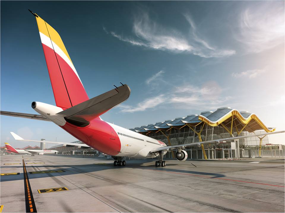
The resulting new brand, in the aforementioned spirit of blending old and new, still employs our longtime signature colours of red and yellow, which are of course traditionally very Spanish – and indeed the primary colours of the national flag. Red in particular, associated with boldness, passion, vitality, and leadership.
The logo, of course, is a central element of the new brand image, and a central element of the logo is the typography, custom-crafted for Iberia, and winning positive reviews from members of the public polled in 36 countries. And here’s something that might not occur to you: the letters also had to be specifically designed to adapt to the contours of the fuselages. As Gonzalo Burjo, CEO of Iberia’s consultant Interbrand, explains, “Since ‘Iberia’ is a six-letter word, two of which are ‘i’s,’ the typography couldn’t be made too elongated, because then it would look narrow. The chosen solution was therefore to expand the space between the letters, which produces a tight and graceful appearance.”
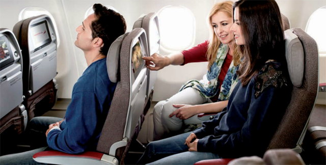
The new logo is already beginning to show up on aircraft fuselages as well as other points of contact with our passengers from online (such as the website you’re looking at now) to airport check-in counters and lounges and of course everywhere on board, including menus, crew uniforms, seat fabrics, and more. As more aircraft cycle through our maintenance hangars, within a few short months the entire fleet will have received the treatment. At the same time, Iberia is continuing to install its new long-haul interiors, including seats with touch screens for in-flight entertainment (below), new cabin lighting and WiFi, as well as other cutting-edge touches.
That way, you see, we’re not just another pretty face. Our new brand image truly heralds a new day for Iberia and our valued customers. If you haven’t flown with us recently, come back and give us another look.
Happy trails and happy holidays!